

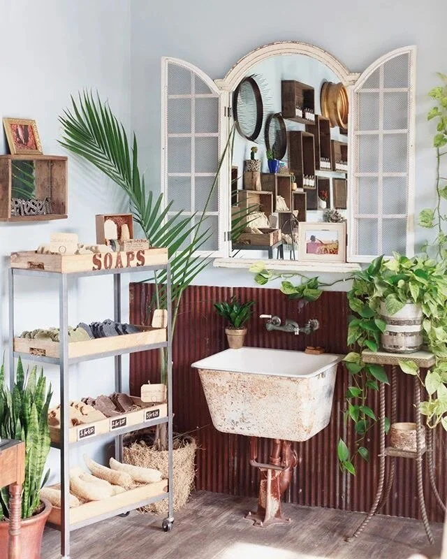
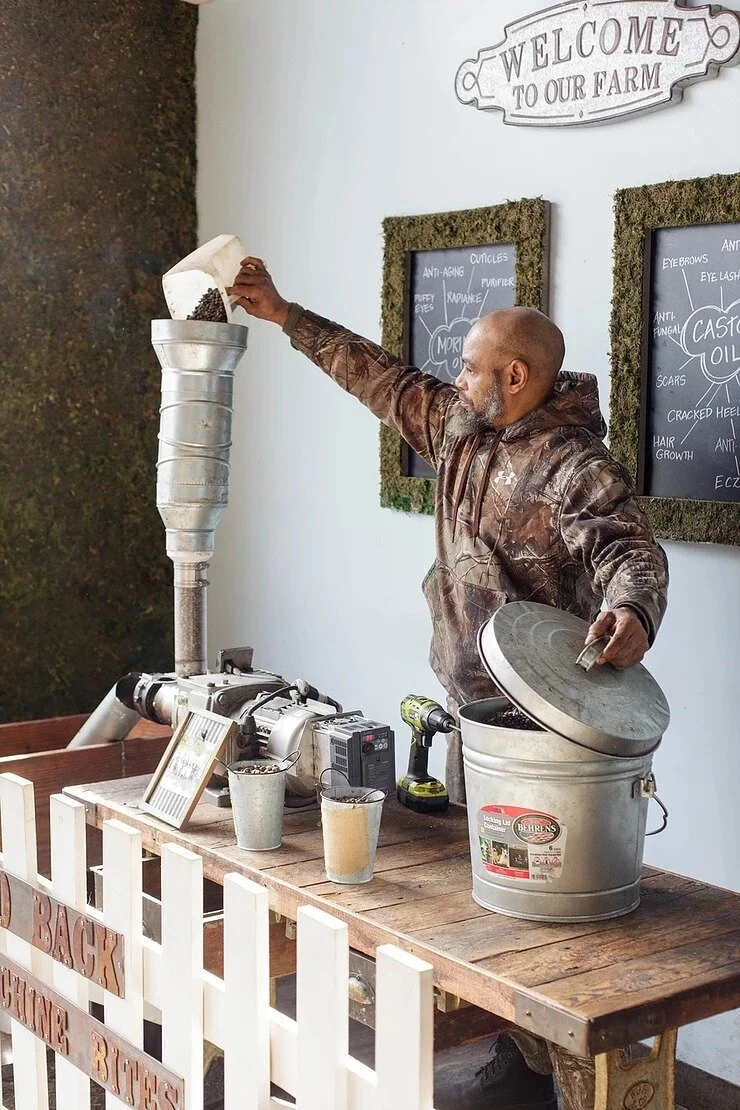
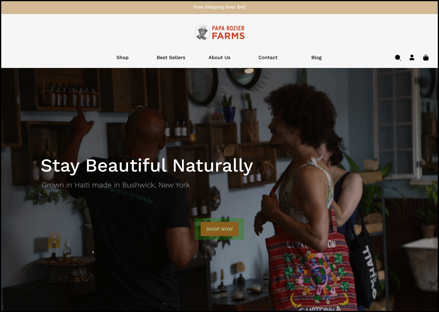
Papa Rozier Farms is a black-owned boutique in Brooklyn, New York. They specialize in all-natural beauty products. The communities they serve know they provide the best in skincare and hair moisturizing products. Unfortunately, their website does not reflect the quality of their products and hospitality. My goal as lead designer was to transform this E-Commerce website into an intuitive, user-centered shopping experience. Basing my redesign on user research, I created a seamless end-to-end user journey by restructuring the information architecture. I utilized aspects of the original UI to create an updated and visually appealing website that showcases this company's greatness and caters directly to its users' needs.
PAPA ROZIER FARMS
Team: Solo Project
Role: UX/UI Designer
Time: 2-week Sprint
Tools: Figma, Notion, Zoom, Google Docs
Disclaimer: Conceptual Project

The Problem.
Naturalists enjoy the safety behind organic products but find it hard to know exactly which ones are truly safe or not. Users want a website that clearly states what each product's benefits are and shows transparency in their ingredients to limit any health scares.
The Goal.
To discover user frustrations with finding natural online products through a series of interviews.
To understand the user journey of the existing “Papa Rozier” website through usability testing.

Double Diamond Design Methodology
DISCOVER
DISCOVER
Here I researched to understand the main problem behind the current site’s information architecture.
Research.
Interviews
Took on three different research methods:
Interviews
Completed 1-on-1 interviews to gain qualitative insights into the problem. This highlighted many competitors in the market that helped me with the competitive and comparative analysis.
Competitive & Comparative Analysis
Based on the 1-on-1 interviews, I did a competitive and comparative analysis of five competitors. During the interview, three of these competitors were brought up for good and bad reasons.
Shea Moisture
Carol’s Daughter
Cantu
Tru Botanicals
Local Beauty Supply Stores
Heuristic Evaluation
Before conducting a task analysis with the current site, I wanted to perform a heuristic evaluation. Here I briefly went over the site’s difficulties on a pass/fail rating, from the visibility of its system status to its minimalist and simplistic design. Recognizing these areas of growth left room to discuss the level of opportunities.
After combing through my research findings, three main insights influenced my final design decisions.
Key Insights:
Description of ingredients and their benefits
Most product ingredient descriptions are unclear, lengthy, and packed with scientific jargon. This makes it hard for the user to understand if it will harm your health and safety or benefit you.
Purchasing online
After coding my interviews through Dovetail, it was noted that many users purchased their natural products online, and most even did outside research on the product.
Difficulty finding that “right” product
Finding a product formulated for a specific hair or skin type is hard. Users want to know they are purchasing something beneficial to their personal needs.
“It’s always a journey trying to find something that’s as organic as it can possibly be.”
DEFINE
DEFINE
From my research findings, it was time to put the naturalist together and see what they needed most!
Persona.
Core Needs
Natural products (chemical free)
Healthy and safe
Deeply rooted
Frustrations
Product organization
Clarity of ingredients and their benefits
Pricing
Location
Worldwide
HMW. . . provide detailed information regarding the ingredients of each organic product.
HMW. . . clearly describe the benefits to users so they can understand if the product is right for them
Task Analysis.

With the pain points highlighted during my heuristic evaluation, I wanted to see if these same difficulties would come to fruition. So I conducted a task analysis for the original site with the users I interviewed.

TASK 1 : Find an oil you would use daily for your hair or face.
home page
25% of users scrolled and chose the featured product
Confused if this is a best seller or not
After clicking “buy,” users are brought to all products
75% of users chose the drop-down option
Confused about the provided categories
The hair category shows up twice
home page
TASK 2 : Find a way to learn more about the company.


75% of users went to the drop-down option for “who we are”
Confused about the labeling and where to learn more
25% of users scrolled to the bottom of the home page and clicked on this
Took users to “all products” instead of learning more
home page
home page
Key Insights:
Confusing categories
Misleading paths
Ineffective call to action button
Opportunity.
DESIGN
DESIGN
From the insights taken from the task analysis, it was clear that the informational architecture of the site needed clarity.
Card Sort.
To understand the faults within the current site map, I conducted a card sort. Here users showed how they grouped every item to help with the update of the new sitemap.


Sketches.

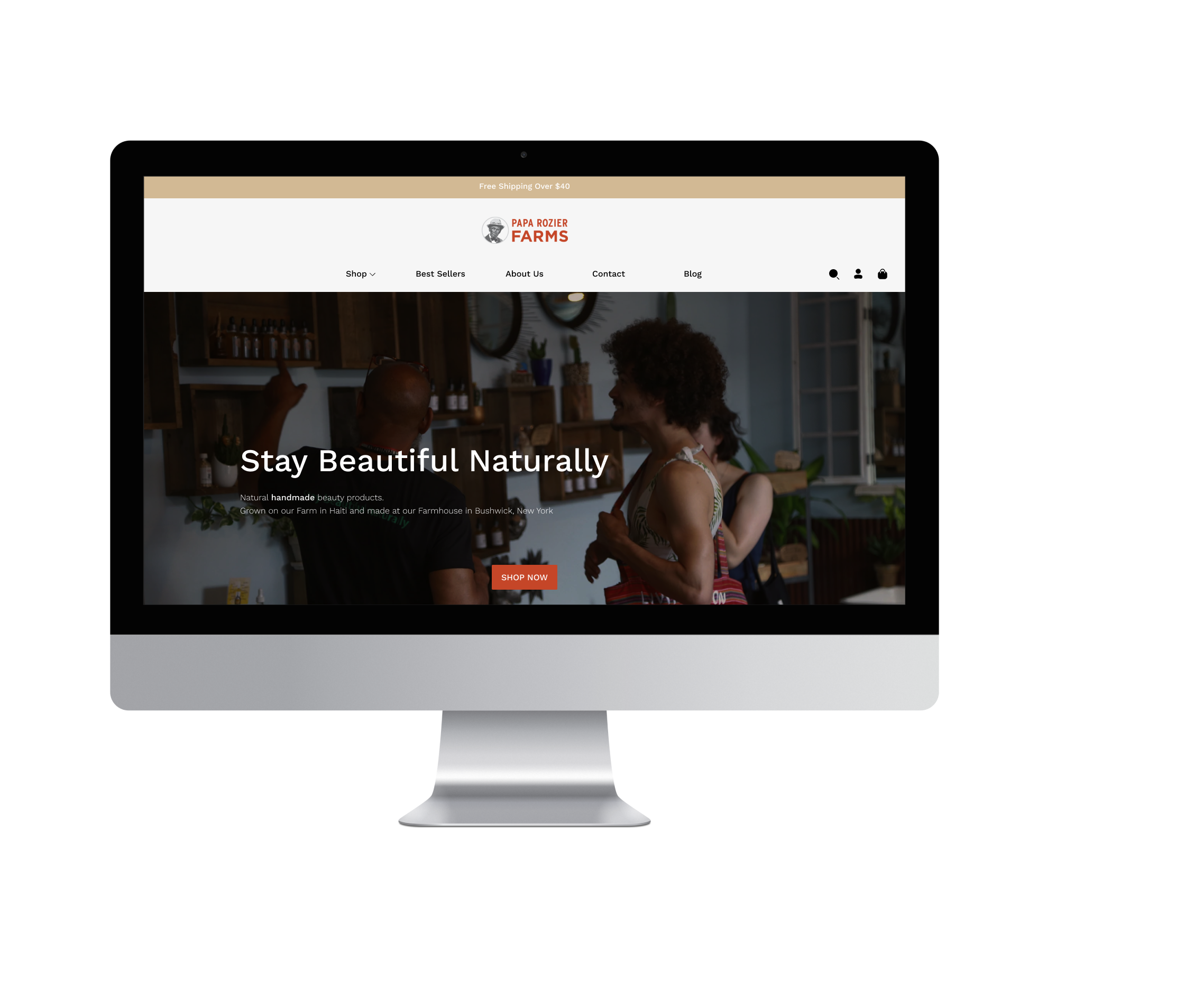
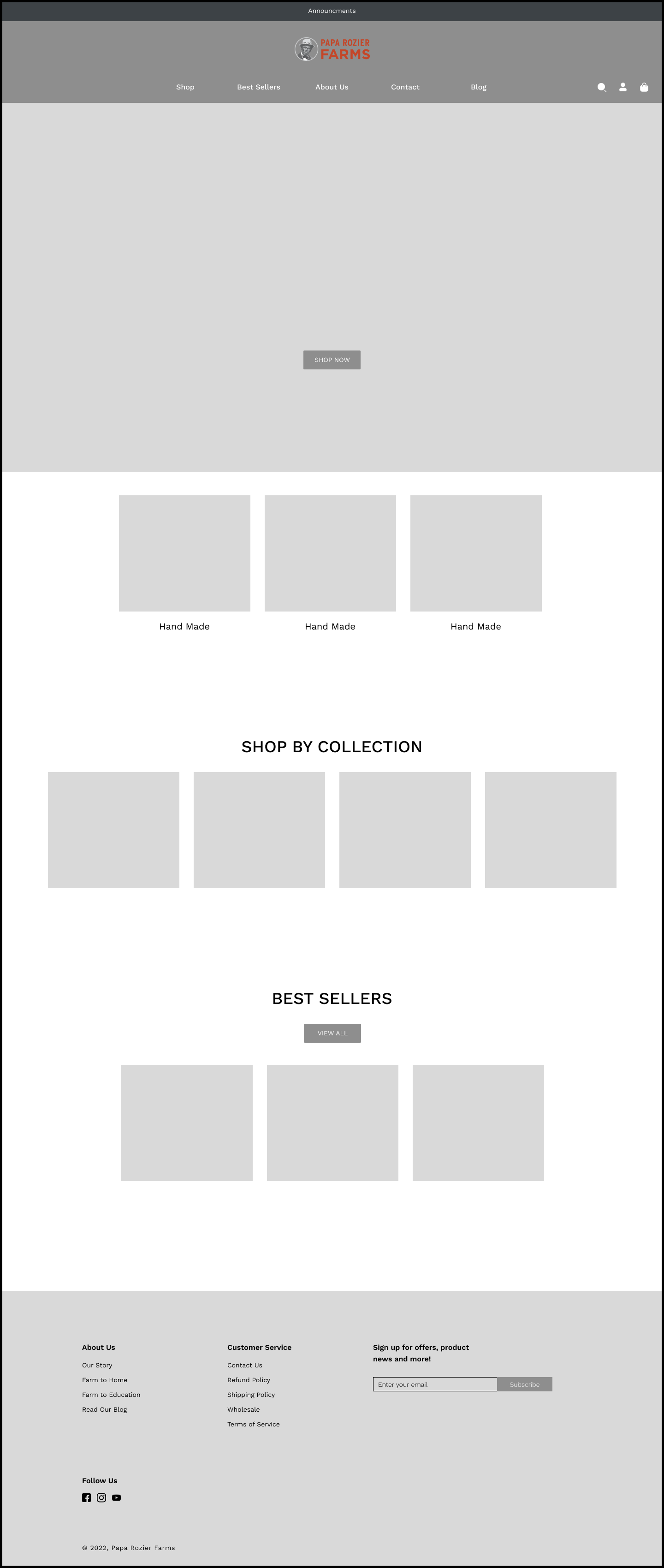
Home Page 1
Clear Call to action button
Clear navigation bar
Home Page 2
Difference is the navigation bar alignment
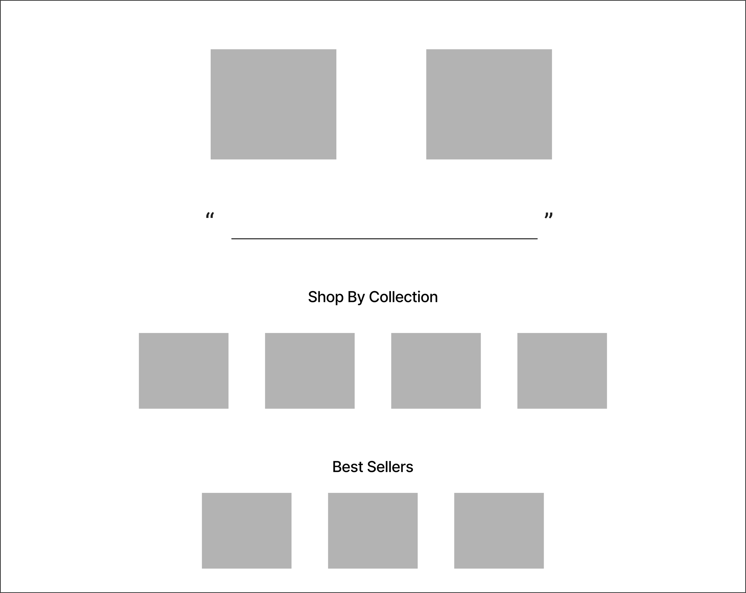
Home Page Scroll
Shop by collection
Shop best sellers
Clear titles
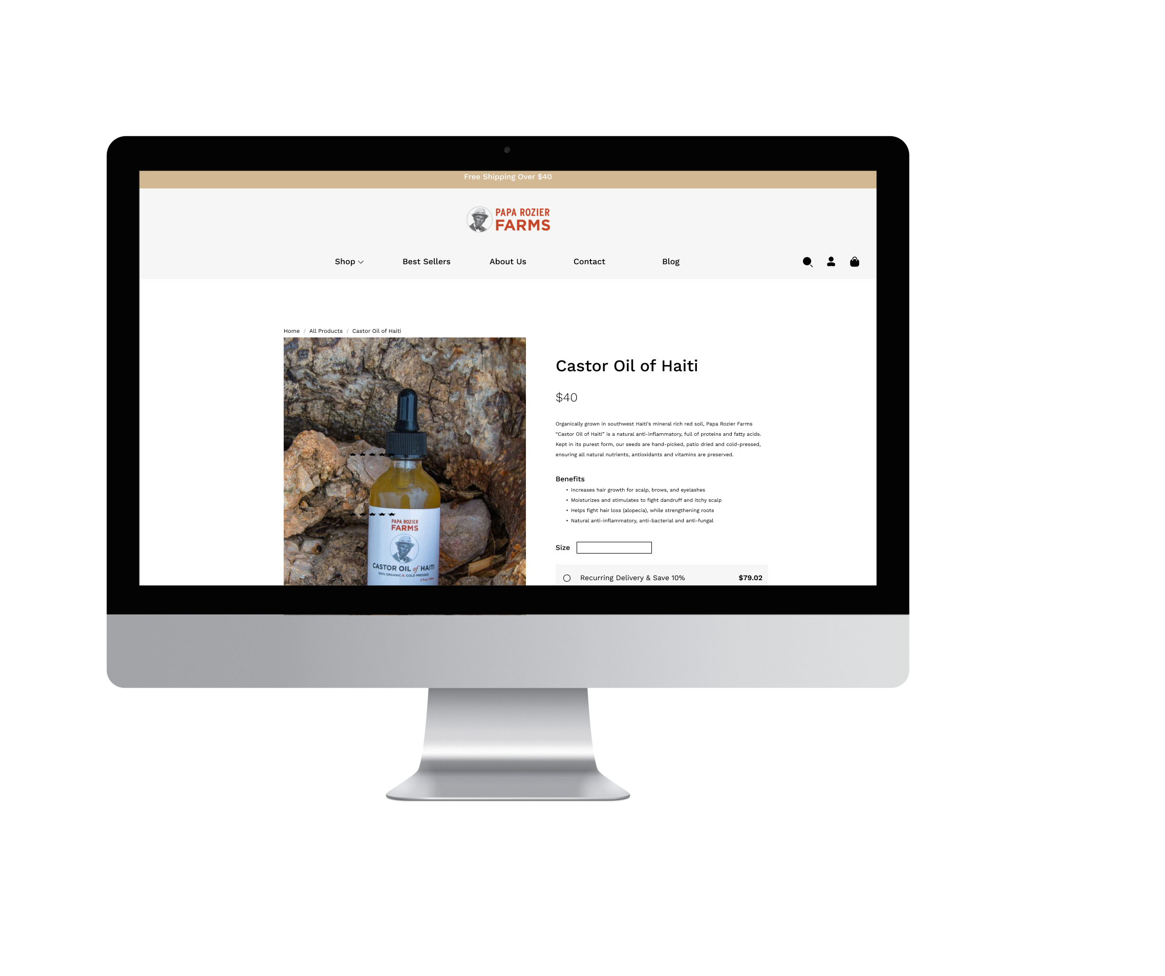
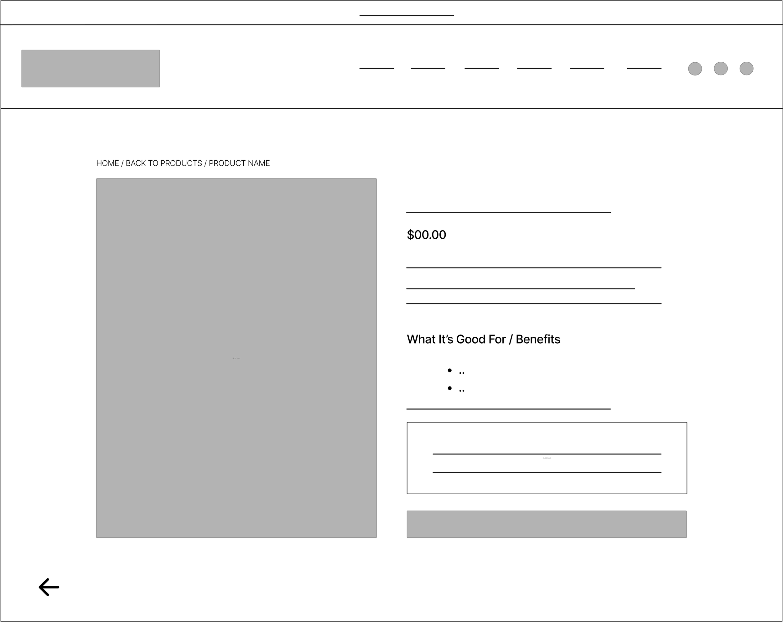
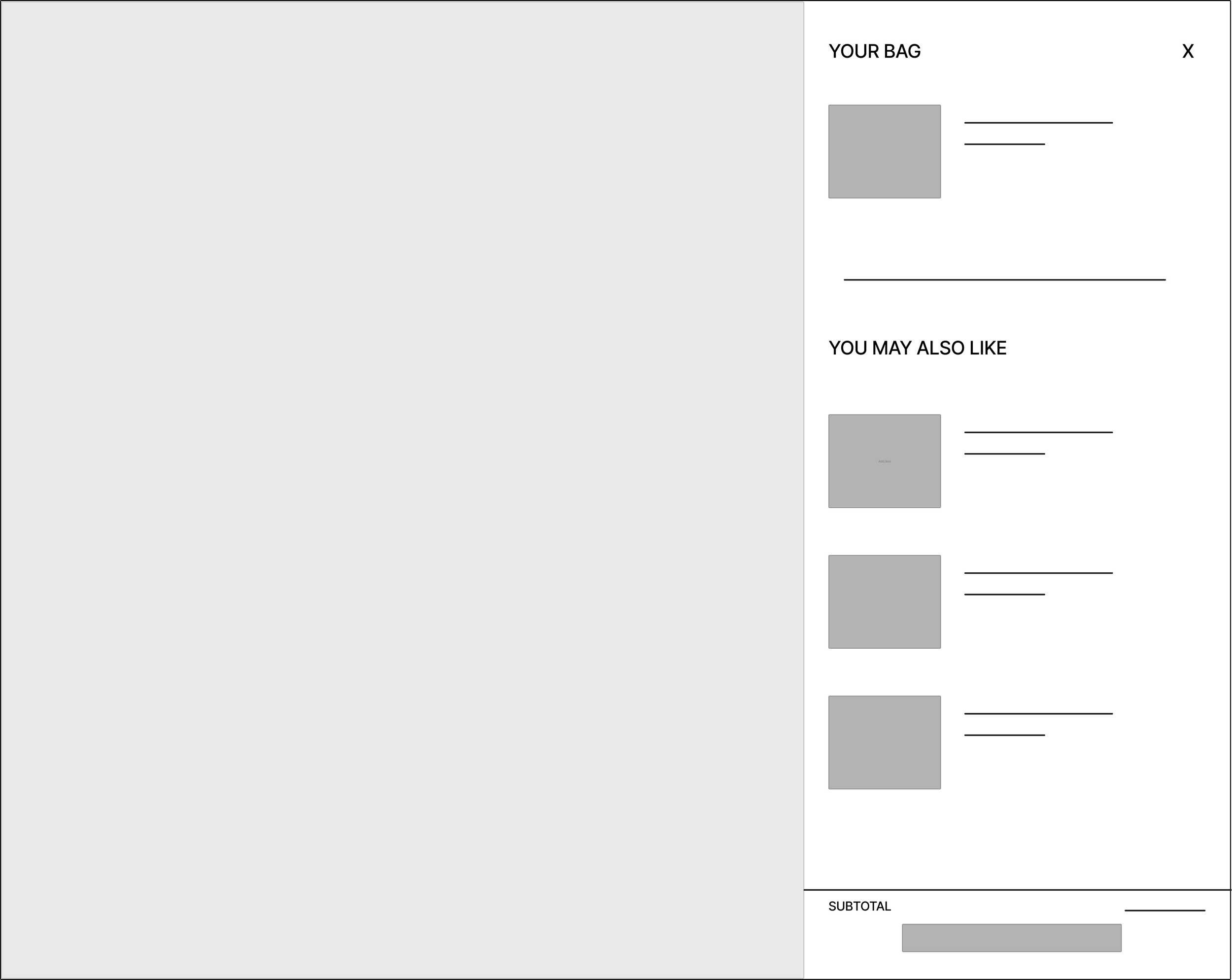
Product Card
Button to go back
Breadcrumbs showing where you are
Benefits list
Large image card
Add to Cart
An Overlay
Showing other products that will fit their hair or skin needs
Current Sitemap
New Sitemap
Wireframes.

Home Page
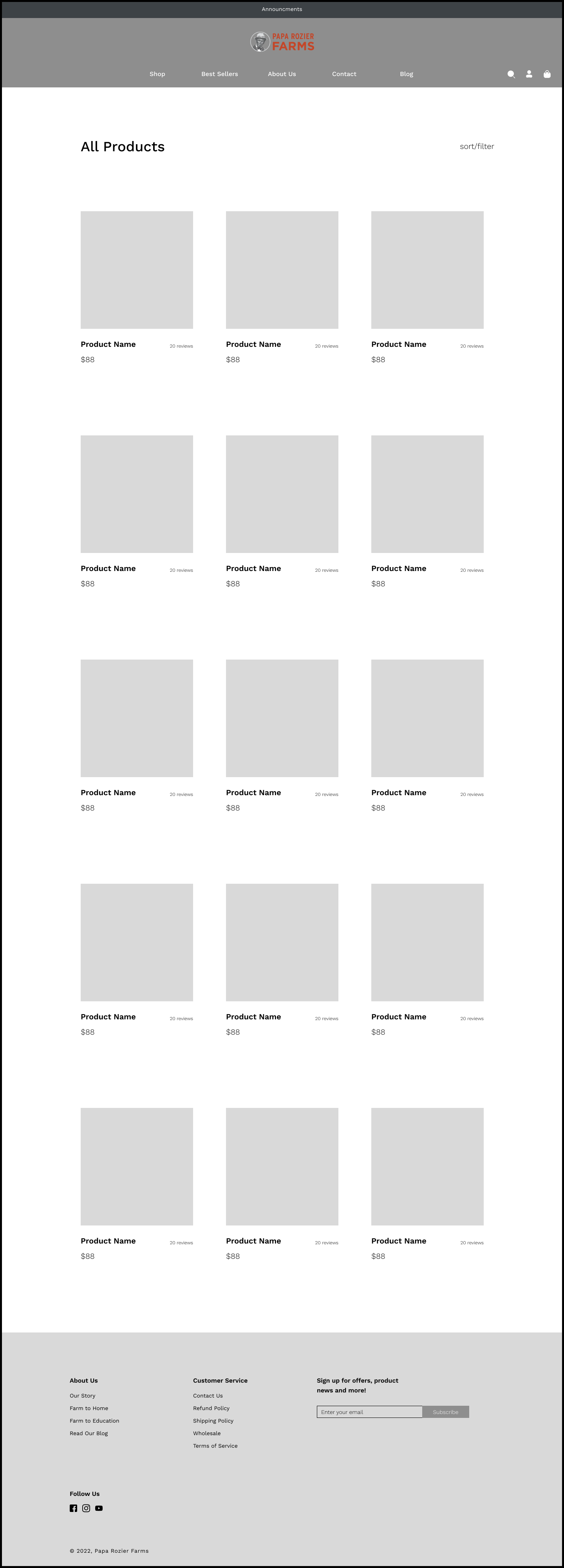
All Products Page
Product Card Page
Usability Test.

Mid-fi prototype
50% of participants chose the hair option in the drop-down to complete the task (wasn’t prototyped)
Chose the “Shop All” option instead
50% of participants chose the “Shop Now” call to action button
Task : Find castor oil for your hair and purchase it
DELIVER
DELIVER
Next Steps.
Gaining more feedback along the way.
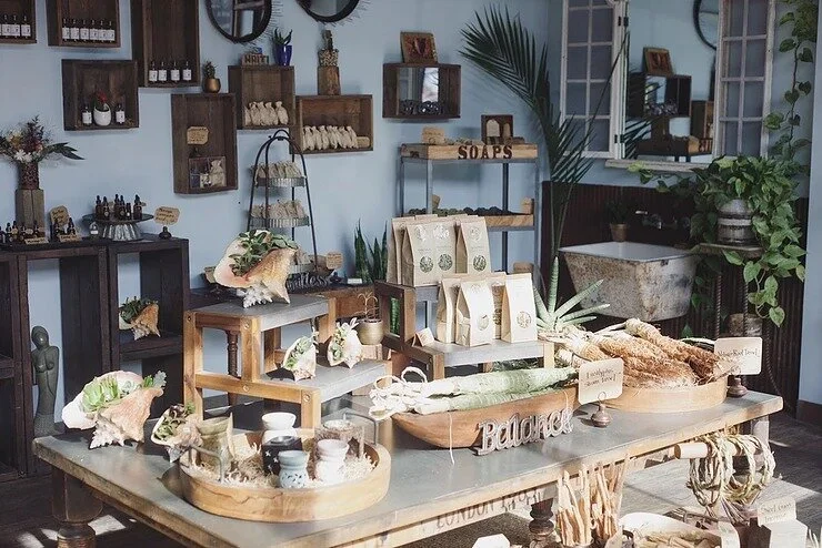
Building out the about us section because this is the most important part of the website for the business. This page also teaches who they are and where their products come from!
Continue to utilize the high-quality imagery found on their Instagram throughout the website. This will allow the business personality and true image to seep out!